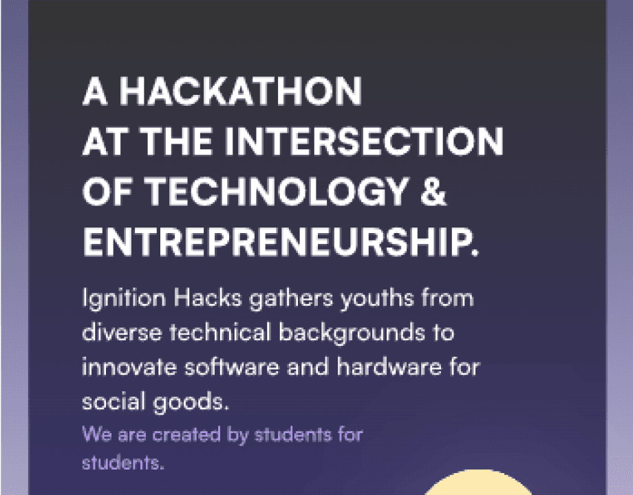
Ignition Hacks v.6
Ignition Hacks gathers youths from diverse technical backgrounds to innovate software and hardware for social goods.
Ignition Hacks v.6
Ignition Hacks gathers youths from diverse technical backgrounds to innovate software and hardware for social goods.
PROJECT SCOPE
Student-led hackathon based in Toronto
PROJECT SCOPE
Student-led hackathon based in Toronto
DURATION
4 Months
DURATION
4 Months
ROLE
UI/UX & Marketing Executive
ROLE
UI/UX & Marketing Executive
TOOLS
Figma, Adobe Illustrator, Canva, Google Suite
TOOLS
Figma, Adobe Illustrator, Canva, Google Suite
PROJECT OVERVIEW
Bringing together high school and post-secondary students to innovate, collaborate, and solve real-world problems through technology. With a strong emphasis on inclusivity, mentorship, and education, the event offers workshops, guest speakers, and competitive project-building over a weekend. As the UI/UX & Marketing Executive, I worked to elevate the digital and physical experience for over 500 participants, mentors, sponsors, and volunteers.
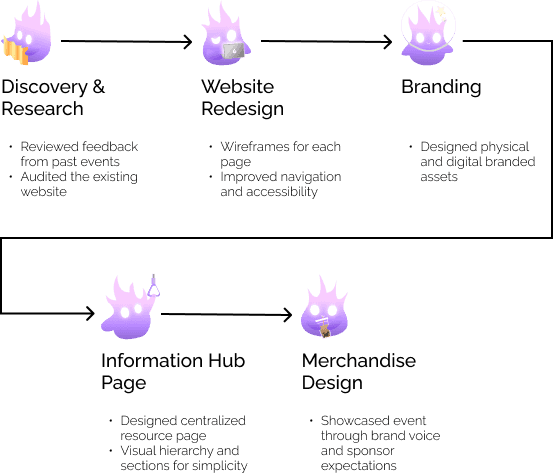
PROCESS OVERVIEW
Discovery & Research
Reviewed feedback from past events
Audited the existing website
Website Redesign
Wireframes for each page
Improved navigation and accessibility
Branding
Designed physical and digital branded assets
Information Hub Page
Designed centralized resource page
Visual hierarchy and sections for simplicity
Merchandise Design
Showcased event through brand voice and sponsor expectations
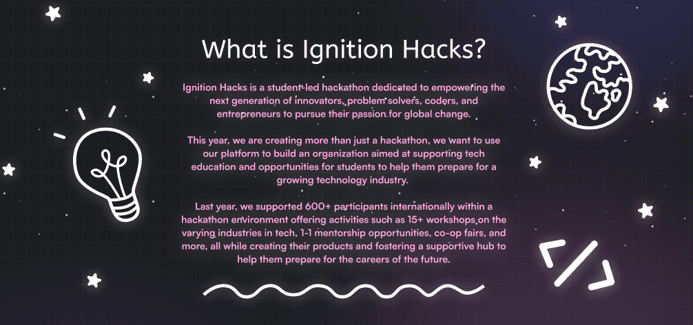
WHAT IS IGNITIONHACKS?
WHAT IS IGNITIONHACKS?
IgnitionHacks is one of Canada’s largest student-run hackathons
IgnitionHacks is one of Canada’s largest student-run hackathons
An event that brings students together to learn, build, and collaborate in an inclusive, community-driven environment. Supported by industry sponsors, experienced mentors, and hands-on workshops, prizes, and other hackathon perks such as an internship with one of the sponsors!
An event that brings students together to learn, build, and collaborate in an inclusive, community-driven environment. Supported by industry sponsors, experienced mentors, and hands-on workshops, prizes, and other hackathon perks such as an internship with one of the sponsors!
DESIGN CHALLENGE
DESIGN CHALLENGE
How might we rebrand IgnitionHacks’ website, merchandise, and digital assets to reflect current design trends while ensuring consistency, accessibility, and an engaging experience for this year’s participants?
How might we rebrand IgnitionHacks’ website, merchandise, and digital assets to reflect current design trends while ensuring consistency, accessibility, and an engaging experience for this year’s participants?
WHY DOES BRANDING MATTER?
WHY DOES BRANDING MATTER?
With so many hackathons happening across Canada, we wanted Ignition Hacks to stand out as a distinctly Toronto-based experience, youth-led, community-first, and future-focused. Our branding isn’t just aesthetic, it’s how we communicate our values of accessibility, innovation, and inclusion at every touchpoint. Whether it’s a social media post that sparks curiosity, a digital schedule that’s easy to follow, or signage that helps someone navigate their first hackathon with confidence, branding shapes how participants feel supported from start to finish. It tells our attendees that we care, not just about tech, but about them.
With so many hackathons happening across Canada, we wanted Ignition Hacks to stand out as a distinctly Toronto-based experience, youth-led, community-first, and future-focused. Our branding isn’t just aesthetic, it’s how we communicate our values of accessibility, innovation, and inclusion at every touchpoint. Whether it’s a social media post that sparks curiosity, a digital schedule that’s easy to follow, or signage that helps someone navigate their first hackathon with confidence, branding shapes how participants feel supported from start to finish. It tells our attendees that we care, not just about tech, but about them.
2023

2024
2025
DISCOVER & RESEARCH
DISCOVER & RESEARCH
Before jumping into design, I wanted to understand what makes Ignition Hacks special.
Before jumping into design, I wanted to understand what makes Ignition Hacks special.
Such as what opportunities existed to improve the user experience for our next event.
Such as what opportunities existed to improve the user experience for our next event.
Reviewed feedback from past events
Reviewed feedback from past events
Analyzed post-event feedback forms and informal discussions from past years events.
Identified recurring user needs and pain points from both participants and organizers.
Analyzed post-event feedback forms and informal discussions from past years events.
Identified recurring user needs and pain points from both participants and organizers.
What was found
What was found
Desire for Clarity
Assessing whether pre-event and live communications were clear, centralized, and easy to follow.
Assessing whether pre-event and live communications were clear, centralized, and easy to follow.
Hackers appreciated the discord channel used but would have preferred a clearer pre-event communication and a one-stop place for all essential info.
Hackers appreciated the discord channel used but would have preferred a clearer pre-event communication and a one-stop place for all essential info.
Navigation Confusion
Evaluating how easily participants could find essential event information across platforms.
Evaluating how easily participants could find essential event information across platforms.
Many attendees mentioned difficulty finding schedules, mentor sign-ups, or workshop details during the event.
Many attendees mentioned difficulty finding schedules, mentor sign-ups, or workshop details during the event.
Positive Emotional Connection
Understanding how the event’s visual identity and tone contributed to feeling of welcome and belonging.
Understanding how the event’s visual identity and tone contributed to feeling of welcome and belonging.
Despite inconsistencies, attendees praised Ignition Hacks for its welcoming and inclusive environment, something we needed to highlight more visually.
Despite inconsistencies, attendees praised Ignition Hacks for its welcoming and inclusive environment, something we needed to highlight more visually.
Auditing the Existing Website
Auditing the Existing Website
Conducted a UX and visual audit of the current Ignition Hacks website.
Identified design inconsistencies and usability gaps.
Conducted a UX and visual audit of the current Ignition Hacks website.
Identified design inconsistencies and usability gaps.
Focus Areas
Focus Areas
Visual Consistency
Mismatched fonts, button styles, and color applications weakened brand recognition.
Mismatched fonts, button styles, and color applications weakened brand recognition.
Information Architecture
The site’s structure was flat, making it difficult for users to find event details or resources quickly.
The site’s structure was flat, making it difficult for users to find event details or resources quickly.
Accessibility
Some pages lacked sufficient contrast and mobile responsiveness, which could alienate first-time hackers or younger audiences.
Some pages lacked sufficient contrast and mobile responsiveness, which could alienate first-time hackers or younger audiences.
Audit Insights
Audit Insights
The website served as an information hub, but not as a brand experience. My goal became to transform it from a static resource into an engaging, story-driven space that reflected the event’s creativity and inclusivity.
The website served as an information hub, but not as a brand experience. My goal became to transform it from a static resource into an engaging, story-driven space that reflected the event’s creativity and inclusivity.
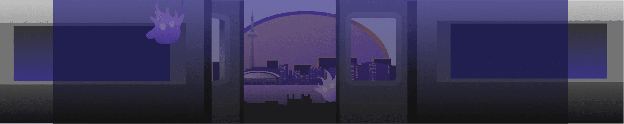
WEBSITE REDESIGN
WEBSITE REDESIGN
Rethink the Ignition Hack’s website
Rethink the Ignition Hack’s website
After identifying usability challenges and branding inconsistencies, we needed to transform the website from an informational landing page into a cohesive, interactive experience that reflects the energy, inclusivity, and creativity of the hackathon.
After identifying usability challenges and branding inconsistencies, we needed to transform the website from an informational landing page into a cohesive, interactive experience that reflects the energy, inclusivity, and creativity of the hackathon.
Goals & Focus Areas
Goals & Focus Areas
The website acts as the first point of contact for most participants, mentors, and sponsors, so it needed to do more than share information, it had to communicate the brand’s spirit and make navigation effortless.
The website acts as the first point of contact for most participants, mentors, and sponsors, so it needed to do more than share information, it had to communicate the brand’s spirit and make navigation effortless.
Redesign Goals:
Redesign Goals:
Simplify Navigation
Create a clearer structure so users can find what they need instantly.
Simplify Navigation
Create a clearer structure so users can find what they need instantly.

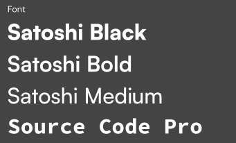
Apply Consistent Branding
Implemented a unified colour palette to evoke energy, excitement, and forward momentum
A typography system to balance approachability and clarity
Component library across all pages
Apply Consistent Branding
Implemented a unified colour palette to evoke energy, excitement, and forward momentum
A typography system to balance approachability and clarity
Component library across all pages

Improve Accessibility
Ensure readability, CTA responsiveness, and inclusive visuals
Improve Accessibility
Ensure readability, CTA responsiveness, and inclusive visuals
2024 version
2024 version

VS.
VS.
2025 version
2025 version
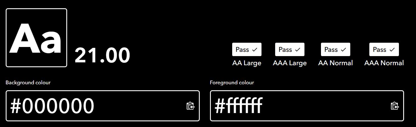
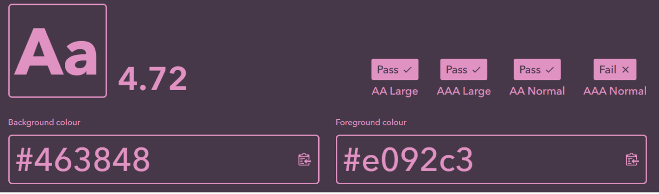
Text Contrast
Text Contrast
WCAG minimum 4.5:1
WCAG minimum 4.5:1
Old website had inconsistent contrast (7.12:1 in some areas, 4.72:1 in others)
Old website had inconsistent contrast (7.12:1 in some areas, 4.72:1 in others)
New website improved readability and accessibility with a consistent 21:1 contrast ratio.
New website improved readability and accessibility with a consistent 21:1 contrast ratio.
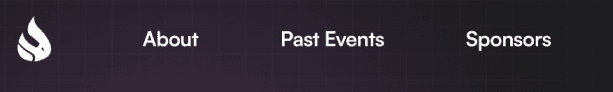
Defining the Site Structure
Defining the Site Structure
Based on insights from the audit and user feedback, we reorganized the site’s information architecture into main sections that reflect the user journey.
Based on insights from the audit and user feedback, we reorganized the site’s information architecture into main sections that reflect the user journey.
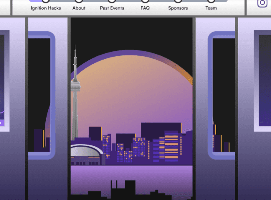
Landing section - Visual set up
About - Overview, mission, values, and statistics
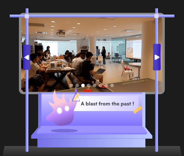
Past Events - Gallery of photos taken from the past
FAQ - Answers of common questions
Sponsors - Partner recognition and outreach opportunities
Team - Highlighting the team
Landing section - Visual set up
About - Overview, mission, values, and statistics
Past Events - Gallery of photos taken from the past
FAQ - Answers of common questions
Sponsors - Partner recognition and outreach opportunities
Team - Highlighting the team
This structure makes it easier for first-time visitors to understand what Ignition Hacks is and for returning participants to jump straight to event details.
This structure makes it easier for first-time visitors to understand what Ignition Hacks is and for returning participants to jump straight to event details.
Wireframing & Layout Exploration
Wireframing & Layout Exploration
Design Focus:
Design Focus:
Consistent header & footer components
Clear section breaks using colour and whitespace
Balanced text-to-image ratio for readability
CTA placement optimized for scrolling patterns
Consistent header & footer components
Clear section breaks using colour and whitespace
Balanced text-to-image ratio for readability
CTA placement optimized for scrolling patterns
Visual & UI Enhancements
Visual & UI Enhancements
Integrated the refreshed branding system:
Integrated the refreshed branding system:
Colour Palette
Combination of bold, energetic hues inspired by sparks and ignition, balanced with neutrals for readability.
Combination of bold, energetic hues inspired by sparks and ignition, balanced with neutrals for readability.
Typography
Clean, modern font pairing that reflects innovation while ensuring accessibility.
Clean, modern font pairing that reflects innovation while ensuring accessibility.
Imagery
Real photos of past events to create authenticity and emotional connection.
Real photos of past events to create authenticity and emotional connection.
Microinteractions
Subtle hover animations for CTA and transitions to make the site feel dynamic and alive.
Subtle hover animations for CTA and transitions to make the site feel dynamic and alive.
Accessibility Improvements
Accessibility Improvements
Made accessibility a priority throughout the redesign.
Made accessibility a priority throughout the redesign.
Increased text contrast for legibility
Added visual cues for active links
Ensured all imagery used alternative text
Optimized layouts for mobile and tablet screens
Increased text contrast for legibility
Added visual cues for active links
Ensured all imagery used alternative text
Optimized layouts for mobile and tablet screens
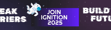
BRANDING
BRANDING
The brand needed to feel energetic and modern while remaining welcoming and accessible to all students.
The brand needed to feel energetic and modern while remaining welcoming and accessible to all students.
To create a cohesive identity for Ignition Hacks 2025, I developed a branding system that reflects the hackathon’s core values: innovation, youthfulness, community, and Toronto pride.
To create a cohesive identity for Ignition Hacks 2025, I developed a branding system that reflects the hackathon’s core values: innovation, youthfulness, community, and Toronto pride.
Branding Objectives
Branding Objectives
Represent Toronto
The event should feel rooted in the city’s creative and multicultural identity.
Stand Out in a Crowded Space
With hackathons happening year-round, Ignition Hacks needed a memorable and recognizable look that differentiates it from others.
Support a Large-Scale Experience
Branding needed to work across web, social media, print, slides, signage, and in-person event spaces.
Ensure Accessibility
Colours, typography, and layouts should be readable and inclusive for a diverse student audience.
Visual Exploration & Moodboarding
Visual Exploration & Moodboarding
Retro, Playful, Character-Based
Retro, Playful, Character-Based
Overall themes:
Overall themes:
Cute + expressive characters
Pixel art + retro user interfaces
Bright primary colors
Playful layouts reminiscent of old-school consoles and gacha toys
Cute + expressive characters
Pixel art + retro user interfaces
Bright primary colors
Playful layouts reminiscent of old-school consoles and gacha toys
What it Represents
What it Represents
Lightheartedness, nostalgia, charm, and youth-friendly creativity.
Lightheartedness, nostalgia, charm, and youth-friendly creativity.
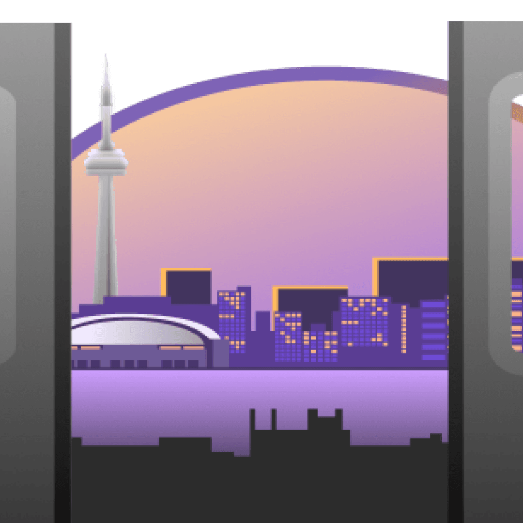
Toronto City & Neon Urban Energy
Toronto City & Neon Urban Energy
Overall themes:
Overall themes:
Urban movement + TTC transit
Bright neon lights and futuristic city atmospheres
Recognizable Toronto skyline and landmarks
Evening/nighttime high-contrast visuals
Urban movement + TTC transit
Bright neon lights and futuristic city atmospheres
Recognizable Toronto skyline and landmarks
Evening/nighttime high-contrast visuals
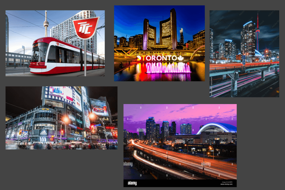
What it Represents
What it Represents
Local identity, urban excitement, and a futuristic tech-driven vibe.
Local identity, urban excitement, and a futuristic tech-driven vibe.
Futuristic, Atmospheric, and Tech-Driven
Futuristic, Atmospheric, and Tech-Driven
Overall themes:
Overall themes:
High-contrast neon gradients
Bold typography with tech motifs
Stylized buildings and interiors
Glitch art and holographic UI
Digital dashboard and event branding aesthetics
High-contrast neon gradients
Bold typography with tech motifs
Stylized buildings and interiors
Glitch art and holographic UI
Digital dashboard and event branding aesthetics
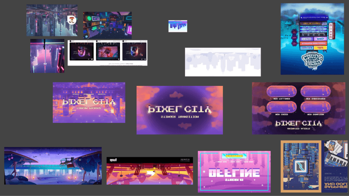
What it Represents
What it Represents
High energy, techno-futurism, and modern digital event branding.
High energy, techno-futurism, and modern digital event branding.
Logo & Iconography
Logo & Iconography
Logo
We modernized IgnitionHacks’ iconic flame logo while keeping its professional, minimal essence.
The core white flame remains the primary logo for its clean geometry and versatility
Including subtle ignition-inspired accents—like sparks in icons and dividers—reinforce the theme across the platform.
We modernized IgnitionHacks’ iconic flame logo while keeping its professional, minimal essence.
The core white flame remains the primary logo for its clean geometry and versatility
Including subtle ignition-inspired accents—like sparks in icons and dividers—reinforce the theme across the platform.
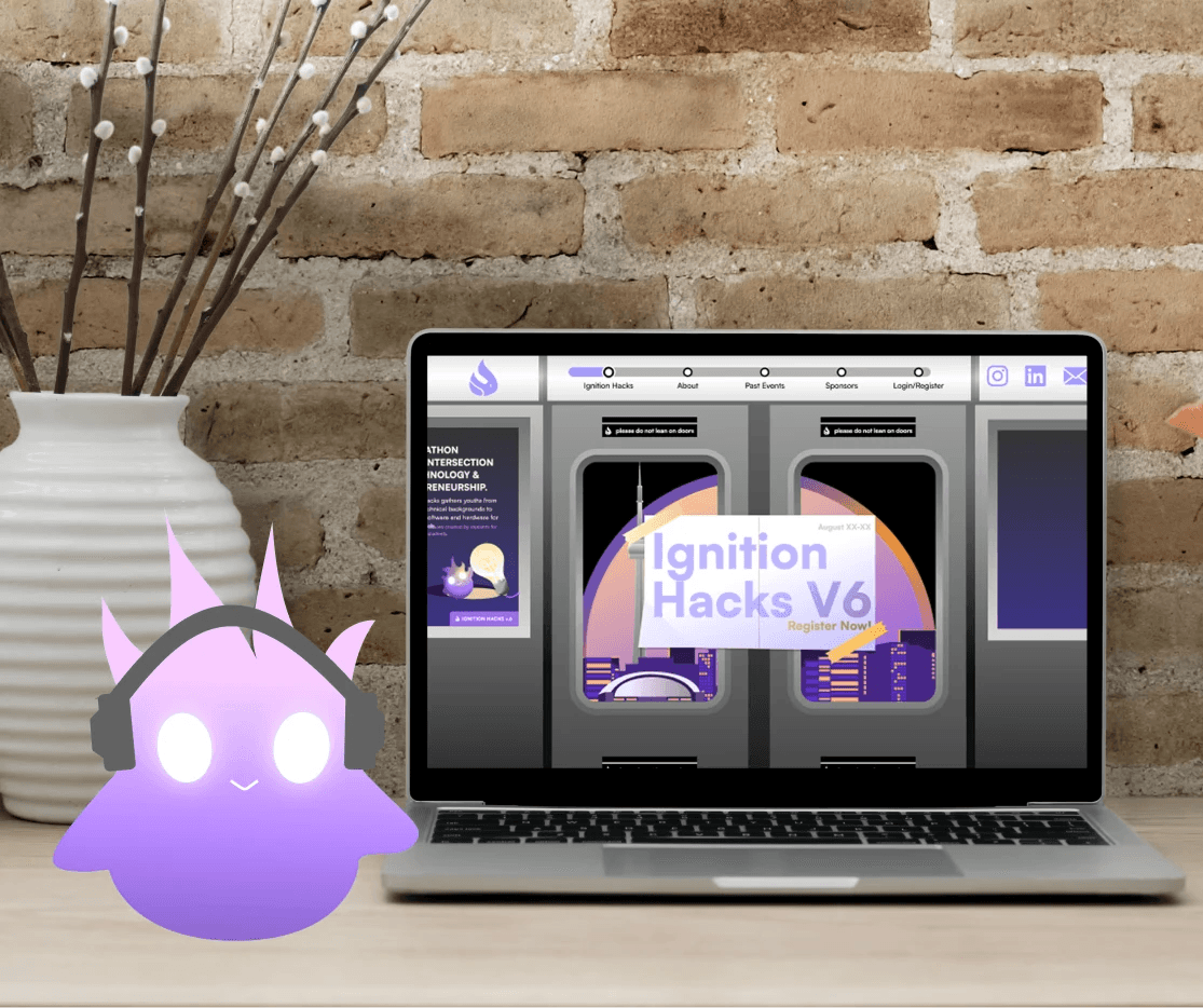
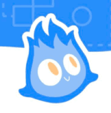
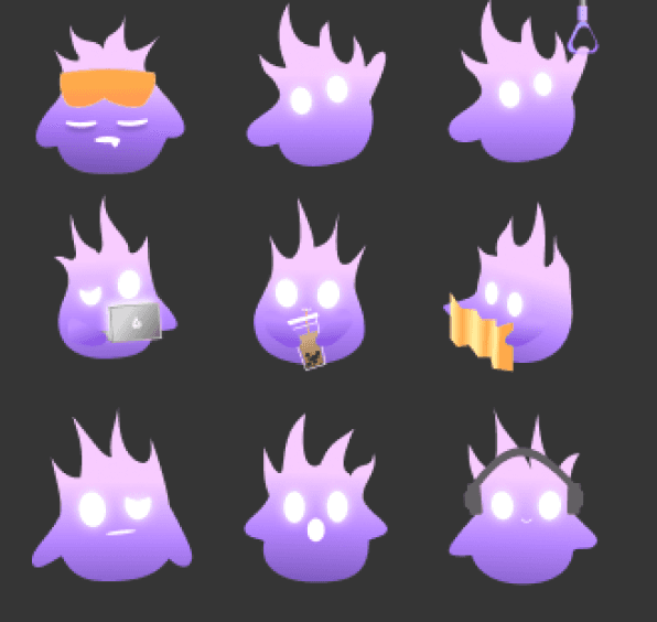
Mascot
The mascot, Iggy, was redesigned to better align with the updated branding.
The mascot, Iggy, was redesigned to better align with the updated branding.

Previously
Previously
A highly expressive blue ember.
2D, no depth.
A highly expressive blue ember.
2D, no depth.
Now
Now
Features purple gradients.
Holographic effect.
A playful, digital-friendly vibe.
Features purple gradients.
Holographic effect.
A playful, digital-friendly vibe.
Component-Based Brand System
Component-Based Brand System
To ensure consistency and scalability across all Ignition Hacks touchpoints, I developed a component-based brand system that could be reused by the entire team.
To ensure consistency and scalability across all Ignition Hacks touchpoints, I developed a component-based brand system that could be reused by the entire team.
These components allowed us to maintain a cohesive visual identity while producing assets quickly and efficiently across multiple platforms.
These components allowed us to maintain a cohesive visual identity while producing assets quickly and efficiently across multiple platforms.
Banners
Banners
Versatile, responsive banners for LinkedIn, Google Forms, and the Notion hacker page.
Every first touchpoint, whether informational or promotional, carried the same energetic and recognizable brand presence.
Versatile, responsive banners for LinkedIn, Google Forms, and the Notion hacker page.
Every first touchpoint, whether informational or promotional, carried the same energetic and recognizable brand presence.
Social Media Templates
Social Media Templates
Flexible templates for Instagram posts and stories enabled the marketing team to create new content easily while preserving visual cohesion.
Supported announcements, countdowns, sponsor highlights, and event updates, all aligned with the brand’s tone and color system.
Flexible templates for Instagram posts and stories enabled the marketing team to create new content easily while preserving visual cohesion.
Supported announcements, countdowns, sponsor highlights, and event updates, all aligned with the brand’s tone and color system.
Instagram Posts
Instagram Posts
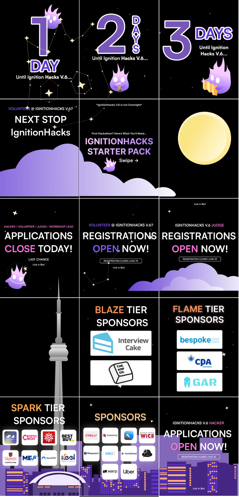
Instagram Stories
Instagram Stories
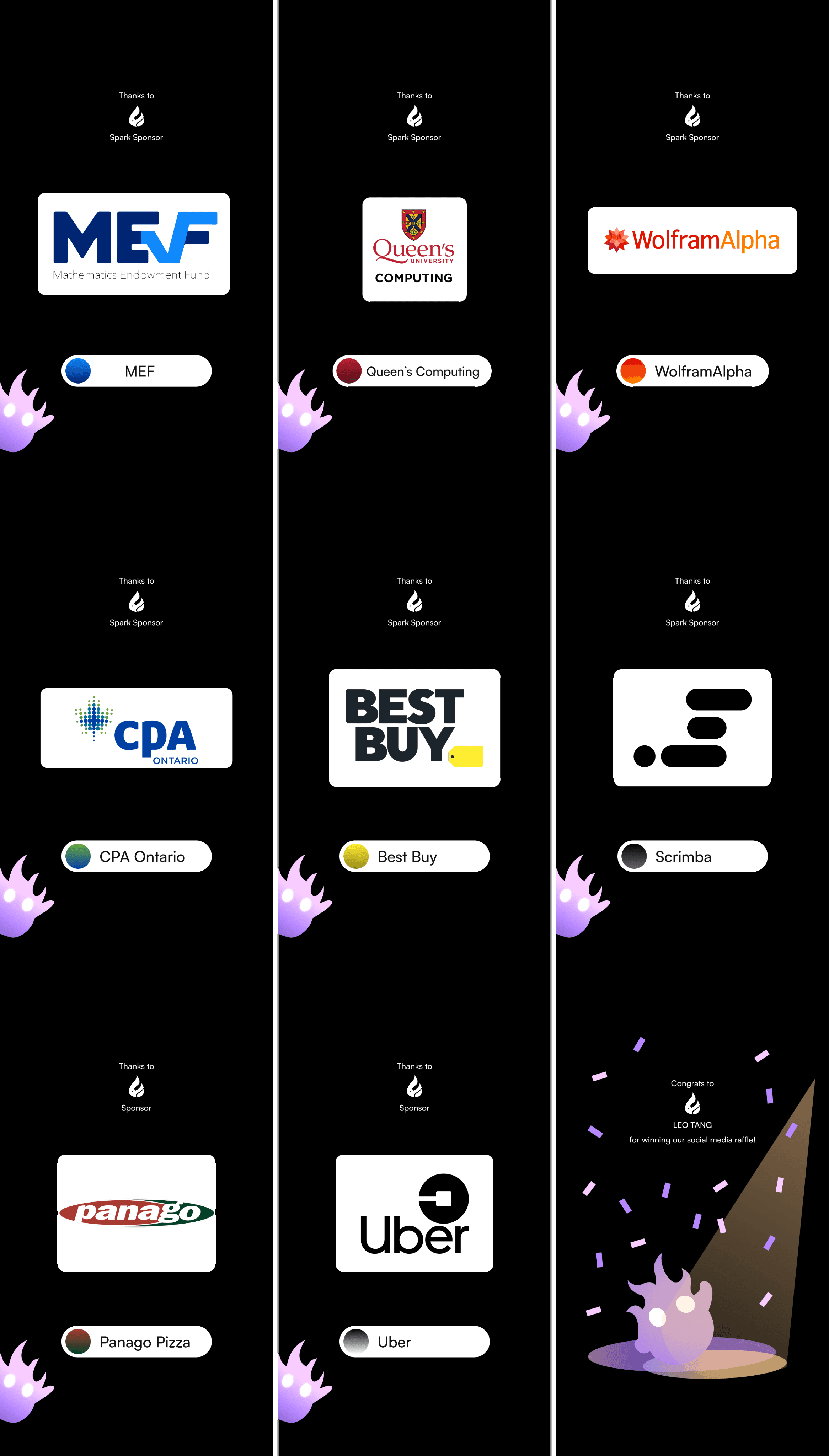
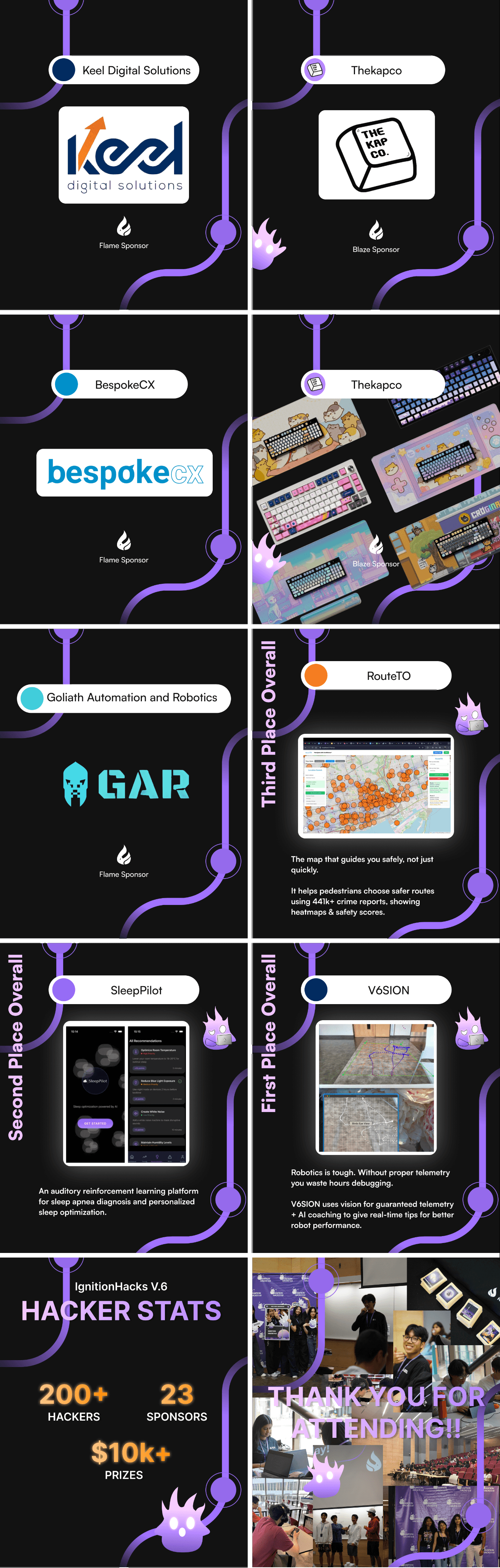
Sponsor Posts
Sponsor Posts
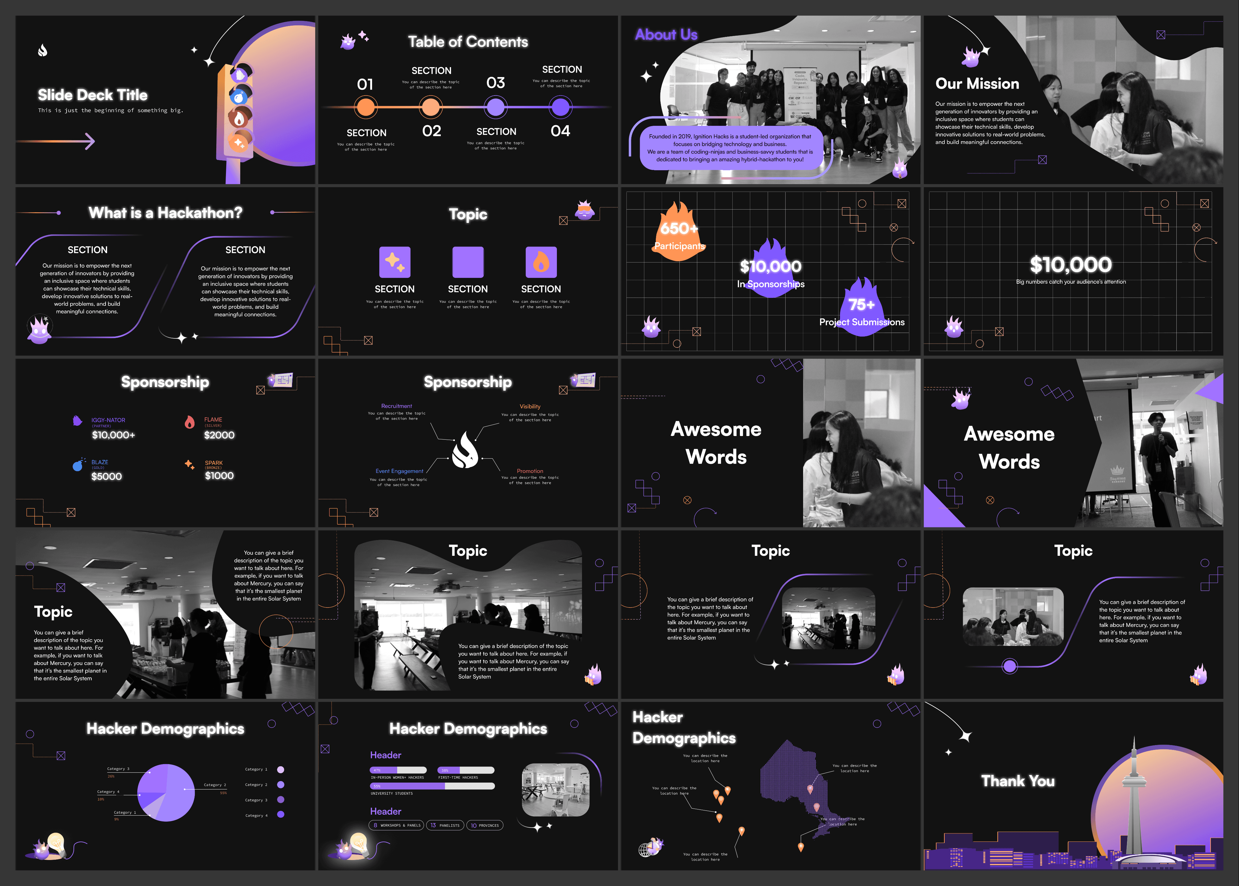
Slide Deck
Slide Deck
A branded slide deck template was designed for workshops, opening ceremonies, sponsor presentations, and internal meetings.
Consistent typography, spacing, and accent elements helped create a polished, professional feel that reinforced the event’s identity across all presentations.
A branded slide deck template was designed for workshops, opening ceremonies, sponsor presentations, and internal meetings.
Consistent typography, spacing, and accent elements helped create a polished, professional feel that reinforced the event’s identity across all presentations.
INFORMATION HUB PAGE
INFORMATION HUB PAGE
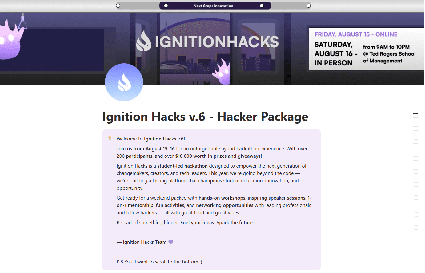
As part of our effort to centralize critical event information and make it easily accessible to hackers, mentors, and sponsors, we built a dedicated Hacker Package page in Notion.
As part of our effort to centralize critical event information and make it easily accessible to hackers, mentors, and sponsors, we built a dedicated Hacker Package page in Notion.
Why Notion?
Why Notion?
Flexibility & Speed:
Flexibility & Speed:
Notion allowed us to rapidly iterate on content without needing to rebuild a web page each time new information came in.
This was especially helpful in the weeks leading up to the event when schedules, mentors, and session details changed frequently.
Notion allowed us to rapidly iterate on content without needing to rebuild a web page each time new information came in.
This was especially helpful in the weeks leading up to the event when schedules, mentors, and session details changed frequently.
Collaboration:
Collaboration:
Team members across design, operations, and communications could all contribute to the hacker page in real time, keeping content up-to-date without back-and-forth through Google Docs.
Team members across design, operations, and communications could all contribute to the hacker page in real time, keeping content up-to-date without back-and-forth through Google Docs.
Interactive & Structured:
Interactive & Structured:
Notion’s database and page structure let us create a rich but navigable layout, ideal for presenting complex hackathon information in a user-friendly way.
Notion’s database and page structure let us create a rich but navigable layout, ideal for presenting complex hackathon information in a user-friendly way.
We needed a centralized, easy-to-use information hub
We needed a centralized, easy-to-use information hub
Purpose & User Needs
Purpose & User Needs
Based on attendee feedback from previous years, users consistently asked for:
Based on attendee feedback from previous years, users consistently asked for:
A single home for all essential event resources
Easy access to schedules, workshops, venue info, and FAQs
A mobile-friendly format they could check quickly during the event
Clear labeling and hierarchy to reduce overwhelm
A single home for all essential event resources
Easy access to schedules, workshops, venue info, and FAQs
A mobile-friendly format they could check quickly during the event
Clear labeling and hierarchy to reduce overwhelm
UX Goals
UX Goals
The Information Hub was designed around four key principles:
The Information Hub was designed around four key principles:
Clarity
Present information in a clean, digestible format with clear headings and intuitive grouping.
Accessibility
Ensure that content is readable on both desktop and mobile, with strong contrast and logical flow.
Scannability
Users should be able to find what they need within seconds—especially during busy event moments.
Consistency
Use the new branding system (colors, typography, components) to maintain cohesion across all event materials.
Structure & Layout
Structure & Layout
I organized the page into clear sections based on real user needs and the flow of the event:
I organized the page into clear sections based on real user needs and the flow of the event:
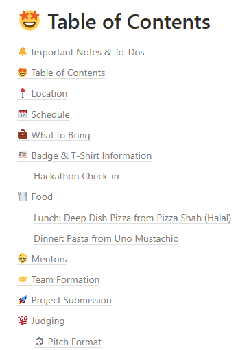
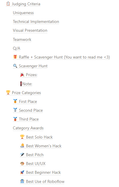
To reduce cognitive load, each section was designed using:
Card components for grouping related content
Accordions for expandable details
Icons for quick visual scanning
To reduce cognitive load, each section was designed using:
Card components for grouping related content
Accordions for expandable details
Icons for quick visual scanning
MERCHANDISE DESIGN
MERCHANDISE DESIGN
The merch reflects the event’s identity, foster team spirit, and create memorable touchpoints that participants would take home after the hackathon ended.
The merch reflects the event’s identity, foster team spirit, and create memorable touchpoints that participants would take home after the hackathon ended.
A key part of my role at Ignition Hacks was contributing to merchandising as it shapes the overall Ignition Hacks experience.
A key part of my role at Ignition Hacks was contributing to merchandising as it shapes the overall Ignition Hacks experience.
Goals for the Merchandise
Goals for the Merchandise
Represent the new Ignition Hacks 2025 branding.
Be versatile and wearable across different settings.
Serve as promotional visuals for social media and event day photography.
Maintain clarity and legibility when printed.
Feel modern and trendy to resonate with our youth audience.
Represent the new Ignition Hacks 2025 branding.
Be versatile and wearable across different settings.
Serve as promotional visuals for social media and event day photography.
Maintain clarity and legibility when printed.
Feel modern and trendy to resonate with our youth audience.
Designing With Trends & Culture in Mind
Designing With Trends & Culture in Mind
This year, we wanted our merch to feel fun and relevant, tapping into trends the hacker community would also be excited about.
This year, we wanted our merch to feel fun and relevant, tapping into trends the hacker community would also be excited about.
Ignition Hacks v.6 Merchandise
Ignition Hacks v.6 Merchandise
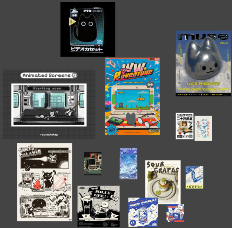
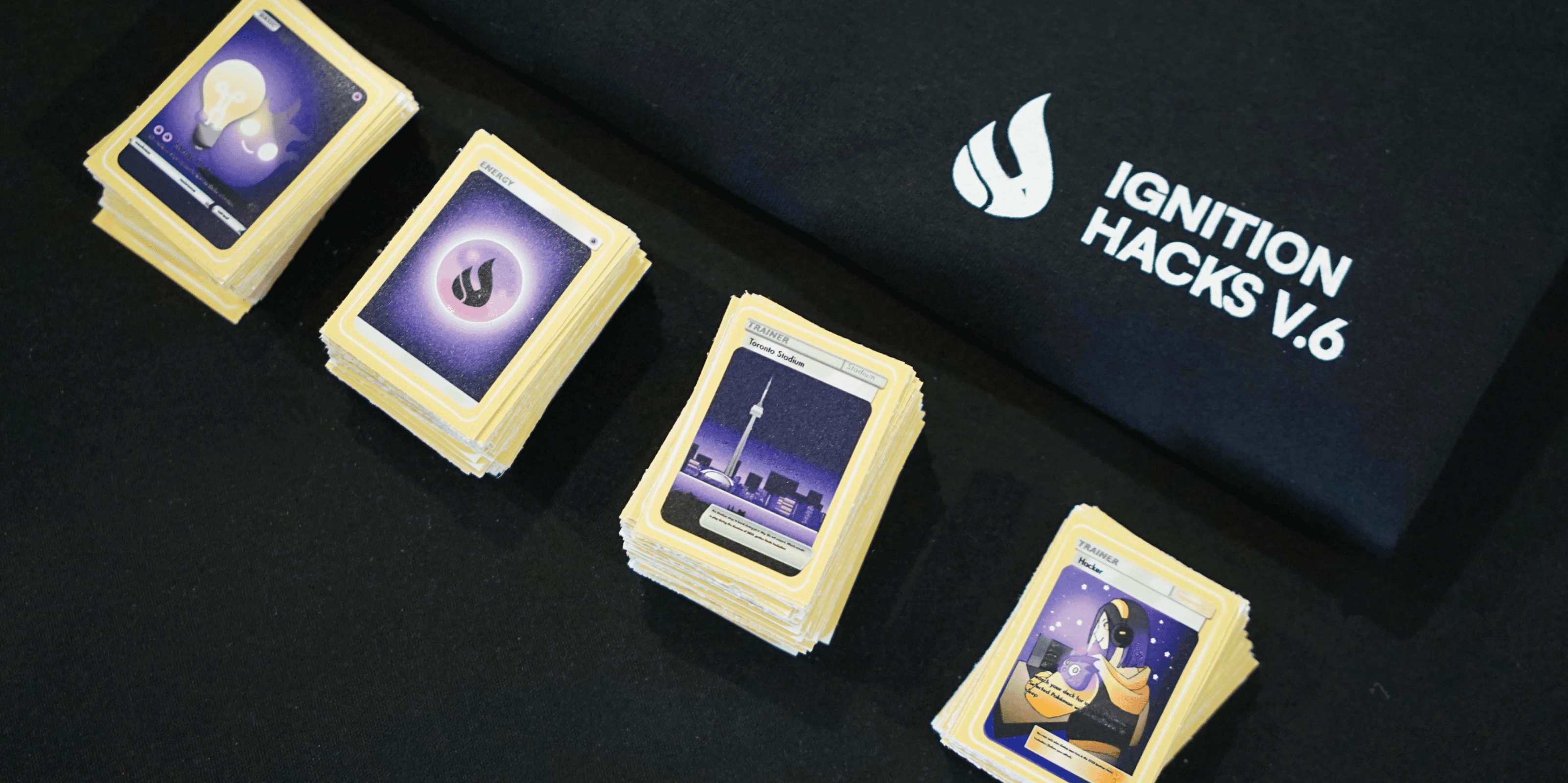
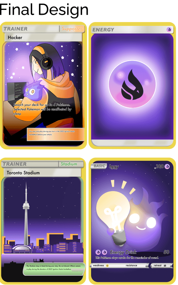
Pokémon-Style Stickers
Pokémon-Style Stickers
We designed collectible stickers inspired by Pokémon cards, one of the biggest nostalgia and pop-culture trends of the year.
We designed collectible stickers inspired by Pokémon cards, one of the biggest nostalgia and pop-culture trends of the year.
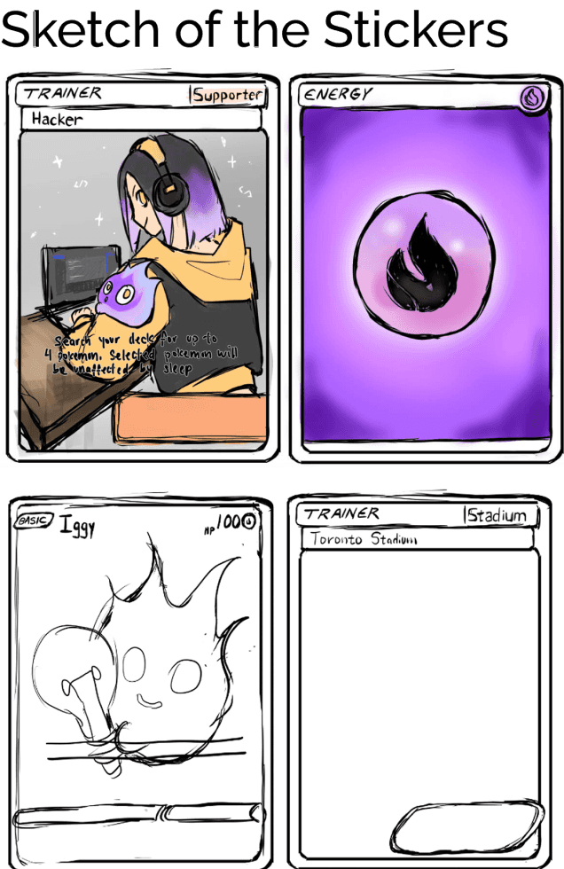
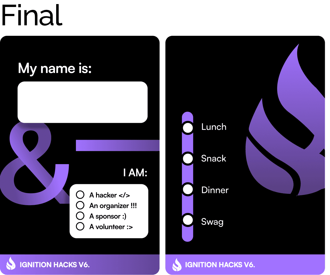
Hacker Badge
Hacker Badge
Essential functional component of the event, serving both as identification and tool for tracking meal and swag distribution throughout the hackathon.
Essential functional component of the event, serving both as identification and tool for tracking meal and swag distribution throughout the hackathon.
First iterations explored heavier use of brand graphics and background elements.
First iterations explored heavier use of brand graphics and background elements.
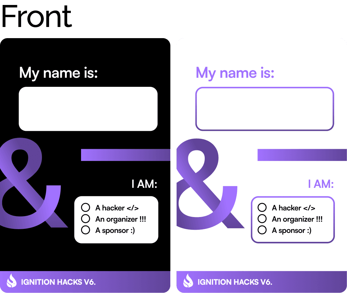
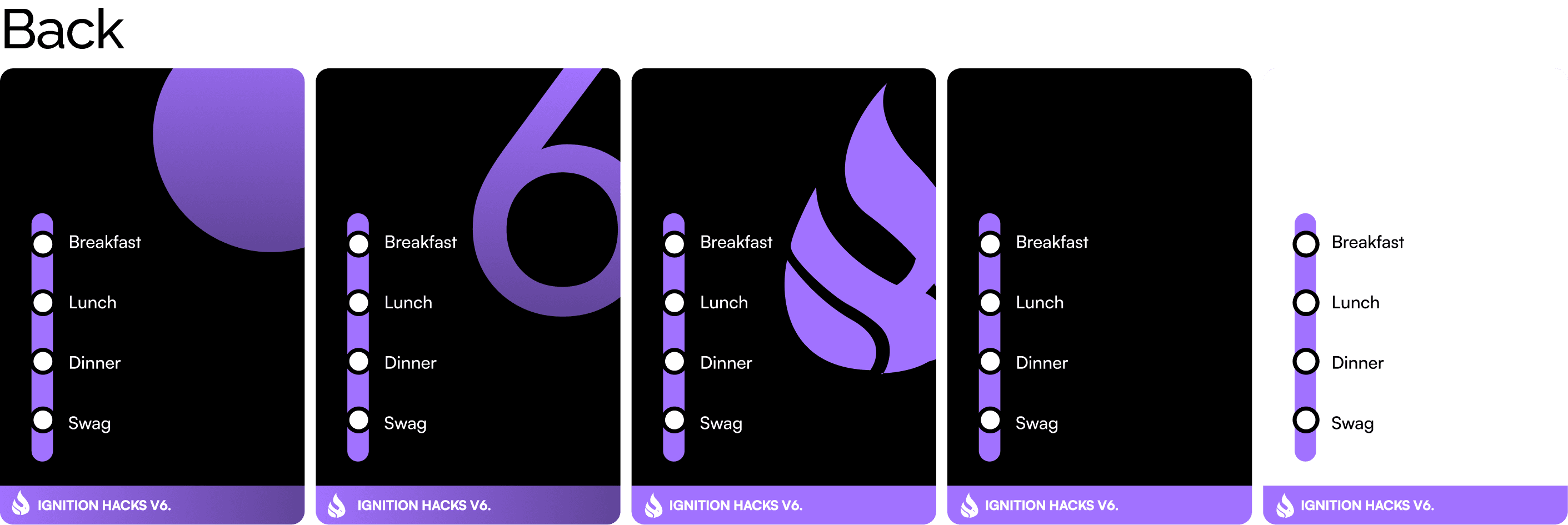
Design Objective
Design Objective
Clearly display hacker’s name.
Provide quick-reference checkboxes for meals.
Use minimal visual noise for easy readability.
Work across multiple print variations (organizer, volunteer, sponsor, hacker).
Clearly display hacker’s name.
Provide quick-reference checkboxes for meals.
Use minimal visual noise for easy readability.
Work across multiple print variations (organizer, volunteer, sponsor, hacker).
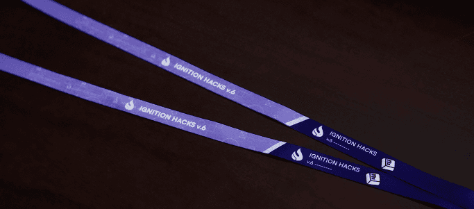
Lanyard
Lanyard
Minimal, clean layout using repeating logo marks.
High contrast to ensure readability for Hackathon name and sponsors.
Minimal, clean layout using repeating logo marks.
High contrast to ensure readability for Hackathon name and sponsors.
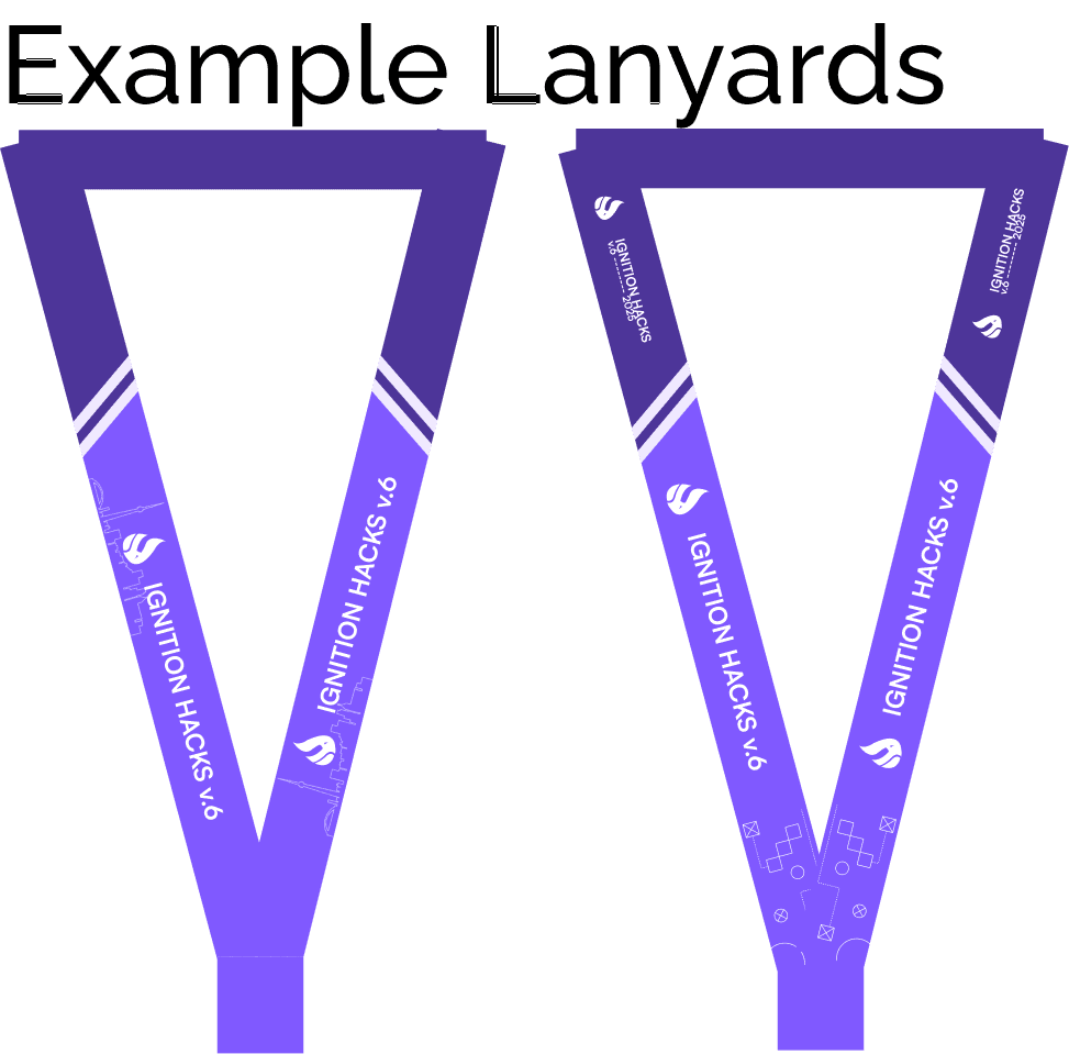
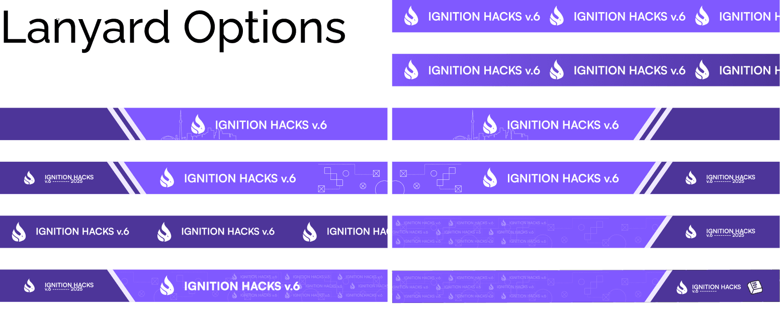
Design Objective
Design Objective
Two-toned purple gradient creates visual depth and movement.
High contrast white text for readability.
Subtle geometry patterns run across the lanyard as a nod to hacker and tech aesthetics.
The repeating Ignition Hacks logo and wordmark along the length of the lanyard reinforce brand recognition.
Two-toned purple gradient creates visual depth and movement.
High contrast white text for readability.
Subtle geometry patterns run across the lanyard as a nod to hacker and tech aesthetics.
The repeating Ignition Hacks logo and wordmark along the length of the lanyard reinforce brand recognition.
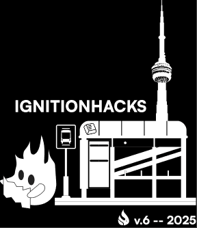
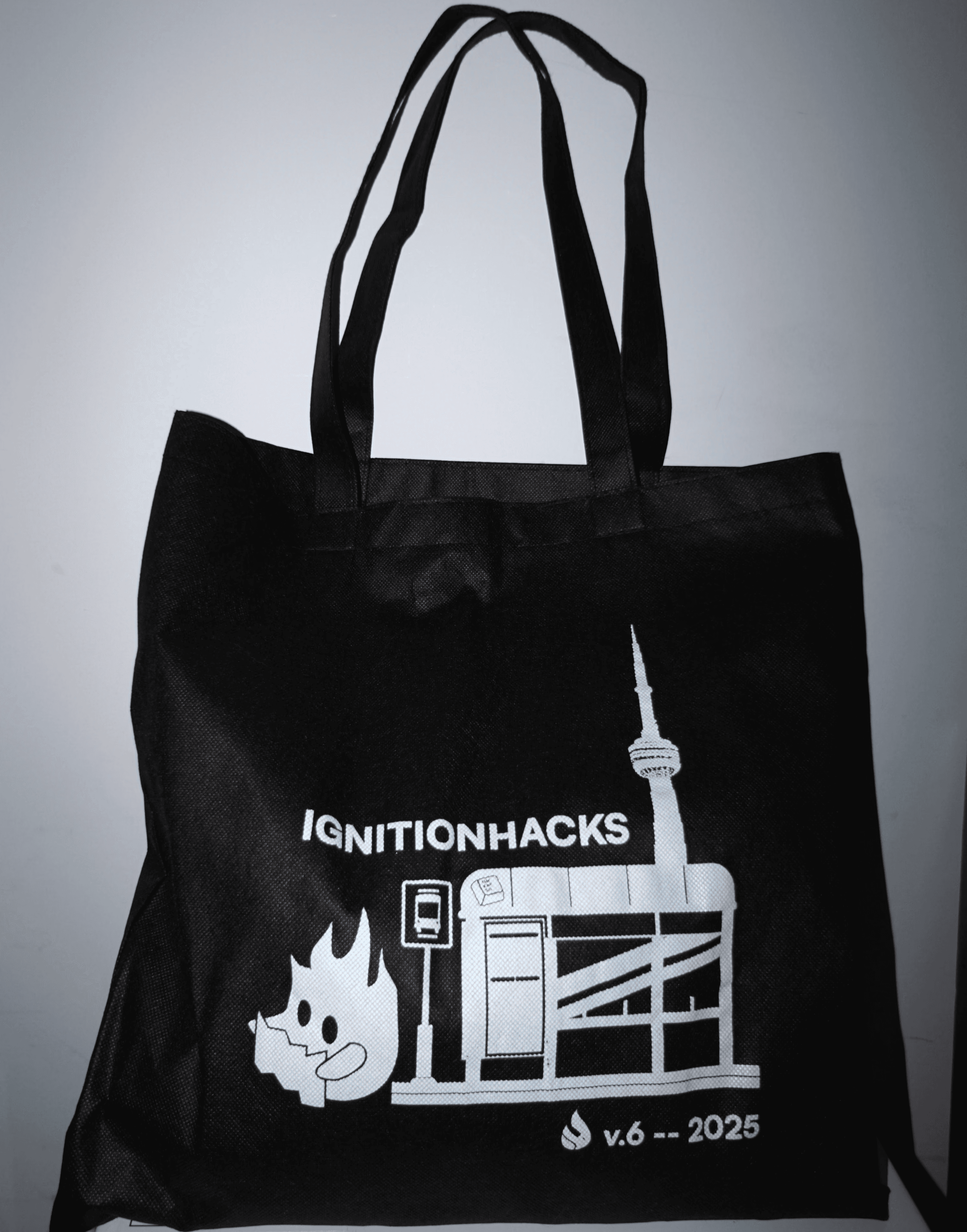
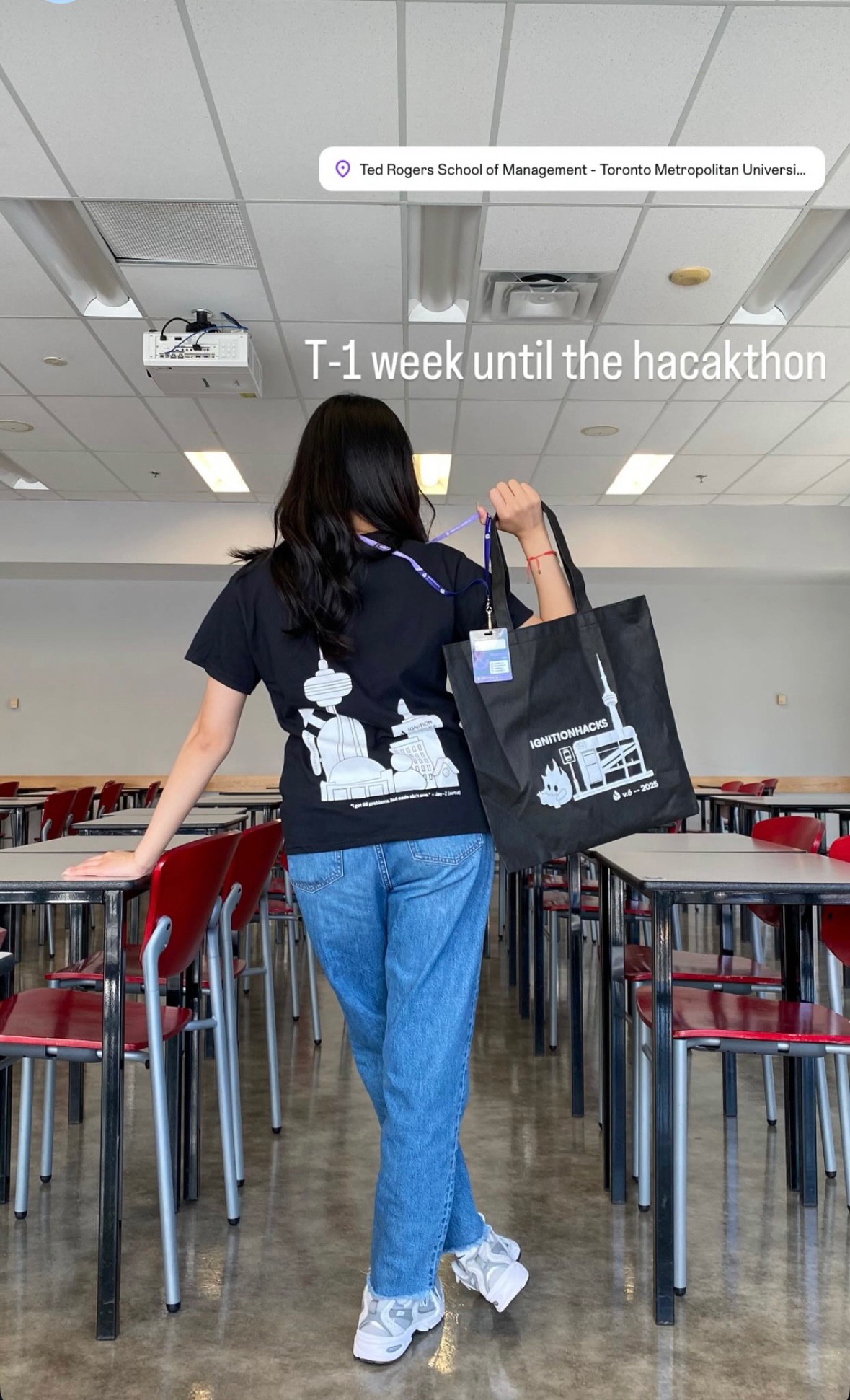
Tote bag
Tote bag
One of the signature merchandise items for the Hackathon as it carries all other assets and is reusable for the hackers.
One of the signature merchandise items for the Hackathon as it carries all other assets and is reusable for the hackers.
First iterations explored heavier use of brand graphics and background elements.
First iterations explored heavier use of brand graphics and background elements.
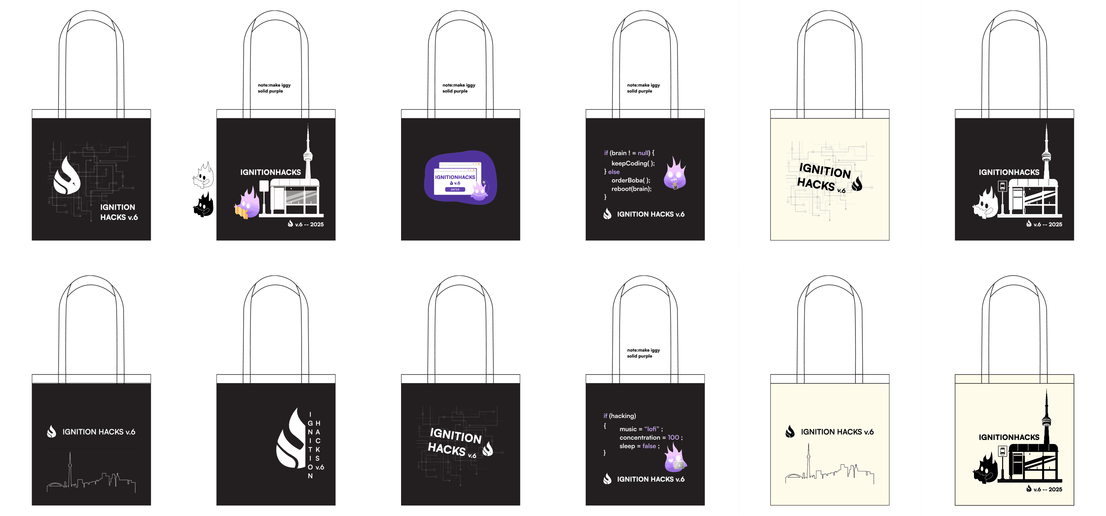
Final Design
Final Design
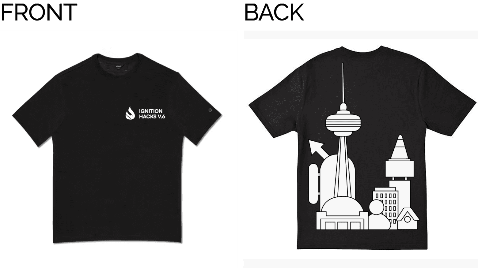
Toronto-Themed Storytelling
Illustration of Iggy waiting at a TTC bus stop in front of the CN Tower
Mascot Integration
Iggy plays a central role in this year’s visual system
Toronto-Themed Storytelling
Illustration of Iggy waiting at a TTC bus stop in front of the CN Tower
Mascot Integration
Iggy plays a central role in this year’s visual system

T-Shirt
T-Shirt
Designed to be stylish, wearable, and strongly branded.
Something participants and organizers would look back on with fond memories.
Designed to be stylish, wearable, and strongly branded.
Something participants and organizers would look back on with fond memories.
First iterations explored a wide range of early concepts that tested different ways of expressing the event’s identity through wearable graphics.
First iterations explored a wide range of early concepts that tested different ways of expressing the event’s identity through wearable graphics.
Mascot-Centric Designs
Use of Iggy on a laptop.
Fun, hacker-themed narrative.
Badge/Name Tag Concepts
Minimal approach tied to event’s identification system.
Toronto-Themed Illustration
Visually rich and on-brand.
Mascot-Centric Designs
Use of Iggy on a laptop.
Fun, hacker-themed narrative.
Badge/Name Tag Concepts
Minimal approach tied to event’s identification system.
Toronto-Themed Illustration
Visually rich and on-brand.
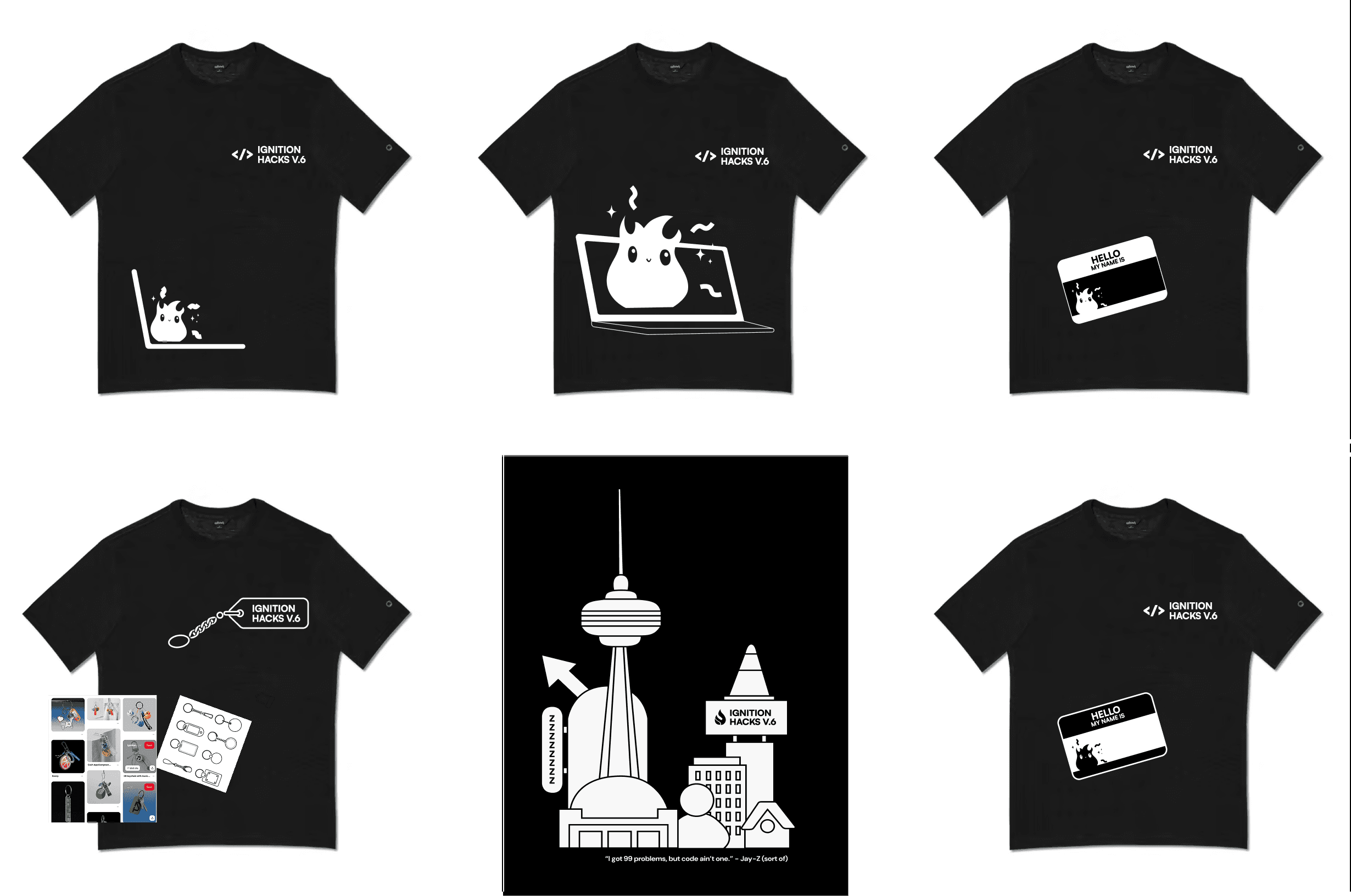
Final Design
Final Design
Front
Clean, modern layout with minimal graphics.
Strong typographic hierarchy to make the event title clear and recognizable.
Back
A more expressive design.
Overall
Simple black and white colourway.
Optimized for screen printing.
Inspiration from streetwear and minimalist tech apparel.
Front
Clean, modern layout with minimal graphics.
Strong typographic hierarchy to make the event title clear and recognizable.
Back
A more expressive design.
Overall
Simple black and white colourway.
Optimized for screen printing.
Inspiration from streetwear and minimalist tech apparel.
These merch pieces unified the branding across physical touchpoints and elevated the participant experience throughout the event.
These merch pieces unified the branding across physical touchpoints and elevated the participant experience throughout the event.
For me, the merch was more than just event swag, it was a way to express the personality of Ignition Hacks and help everyone feel at home.
We approached the merch almost like a uniform, not something mandatory, but something that naturally brought people together.
Uniforms symbolize shared identity and belonging, and that’s what we wanted to create.
By blending Toronto-inspired storytelling with trendy, youth-focused design, the merch helped unify participants and contributed to a cohesive, memorable event experience.
FINAL OUTCOME
FINAL OUTCOME
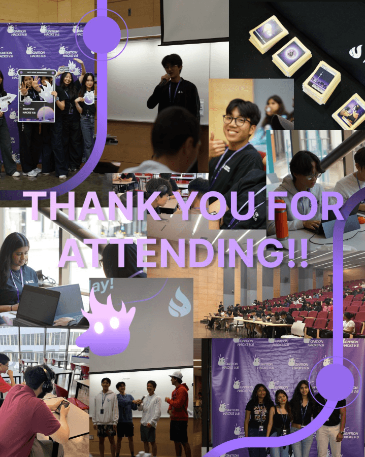
Ignition Hacks v6 successfully brought together hundreds of participants for a memorable, high-energy hackathon experience.
Ignition Hacks v6 successfully brought together hundreds of participants for a memorable, high-energy hackathon experience.
Key Takeaways
Key Takeaways
Branding is more than visuals
Branding is more than visuals
It influences how users navigate, communicate, and feel throughout an experience.. A strong visual system brings consistency and confidence to both participants and organizers.
It influences how users navigate, communicate, and feel throughout an experience.. A strong visual system brings consistency and confidence to both participants and organizers.
Details matter, even the small ones
Details matter, even the small ones
A lanyard, badge layout, or sticker illustration can significantly impact usability, event flow, and user joy.
A lanyard, badge layout, or sticker illustration can significantly impact usability, event flow, and user joy.
Collaboration fuels stronger outcomes
Collaboration fuels stronger outcomes
Working closely with organizers, marketing, and operations showed how multidisciplinary input creates more effective and inclusive solutions.
Working closely with organizers, marketing, and operations showed how multidisciplinary input creates more effective and inclusive solutions.
CONCLUSION
CONCLUSION
A Reflective Look at What We Built
A Reflective Look at What We Built
From the redesigned website to the improved information hub and branded merch, every decision contributed to helping participants feel supported and connected. Moving into Ignition Hacks v7, I hope to build on this foundation by refining the brand system further, improving digital clarity, and continuing to create moments that make participants feel at home and part of a community.
From the redesigned website to the improved information hub and branded merch, every decision contributed to helping participants feel supported and connected. Moving into Ignition Hacks v7, I hope to build on this foundation by refining the brand system further, improving digital clarity, and continuing to create moments that make participants feel at home and part of a community.
To visit the website, click this link!
To visit the website, click this link!